From wall art and accent chairs to storage boxes and home decor accessories, this edition of Interior Inspirations shows you how to add pops of color to a room.
Home Decor Tips: Adding Pops of Color
When it comes to decorating your home, a good rule of thumb is to choose neutral colored furniture (such as sofas and tables), as these tend to be wiser investment pieces for the long haul. Since these types of furniture are generally the largest purchases you’ll make for a particular room, opting for neutral hues (like ivory, black, tan, and gray) gives you the most flexibility relative to incorporating pops of color into the space (without feeling overwhelmed or making choices based on current decor trends).
In addition, using neutral tones as the foundation of a room allows you to more easily change up the look of the decor by replacing less expensive pieces (such as throw pillows, storage boxes, and home accessories) more frequently.
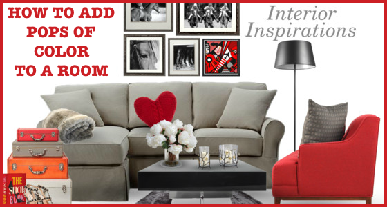
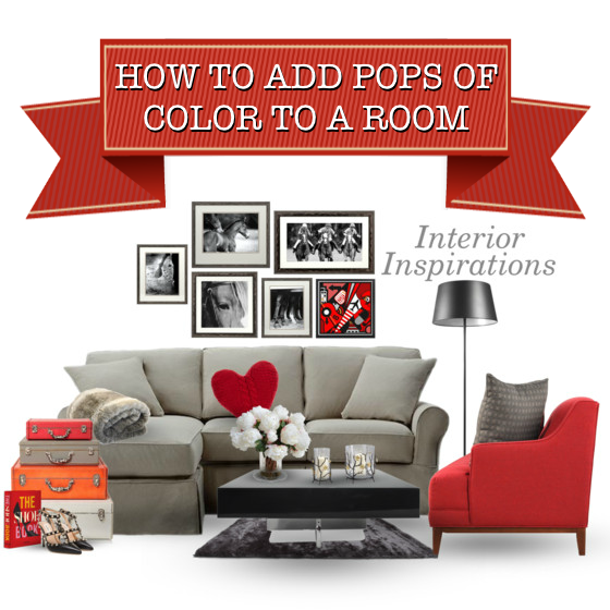
To ensure your home doesn’t end up resembling a corporate office (by using only neutral shades), adding fun pops of color help make a big impression without costing a fortune. As shown in the example above, a vibrant red hue brings a neutral-colored room to life, injecting much-needed cheerfulness and life into the space.
A striking red-colored accent chair (off-set by a gray patterned pillow), a sweet heart-shaped throw pillow (in a deep rouge hue), wall art with a myriad of red tonalities, and miscellaneous accessories (such as storage boxes and a coffee table book) in shades of red instantly convert an otherwise bland room into an exciting and dynamic haven for entertaining and enjoying.

Pops of color are meant to add visual appeal to a room, while helping to move the eye from one part of the space to another. That’s why it’s important to strategically position different pieces (that provide those bold pops of color) throughout the room. Pops of color are the highlights you want to show off in a space. Think of it like reading a book – your eye is trained to go from top to bottom, left to right. By using pops of color in specific parts of a room, you help to guide the eye from one section to the next, drawing the viewer’s attention to particular pieces.
When adding pops of color to a room, the options are endless. From shocking neons and watercolor pastels to eye-catching vibrant hues, there’s no limit to the shades you choose as your accent color. When deciding on which splash of color you want to use, think about the room you are decorating and the overall mood you want it to create. Soft pastels (like baby blue, lavender, and pale pink) are calming, while bold primary colors (such as yellow and red) are stimulating.
By following these easy home decor tips, you can create a beautiful decor space you’re proud to invite guests to see.
[Image via Polyvore]


these are some amazing tips!:)
Konstantina | THE GIRL WITH THE DREAMCATCHER TATTOO
( IG : @Konstantina.A )
Thanks, Konstantina. xoxo